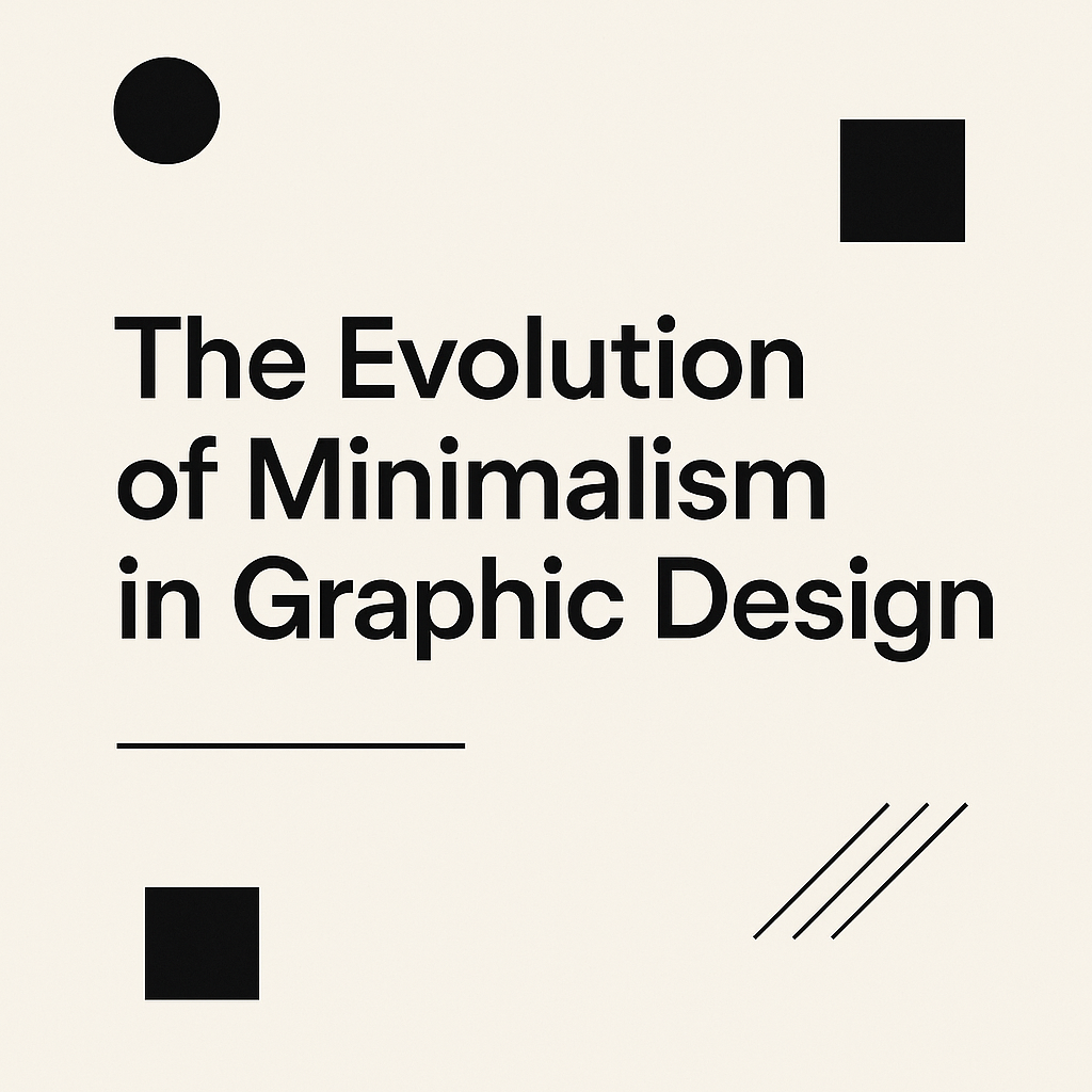
Minimalism in graphic design has come a long way, evolving from basic shapes to carefully planned layouts that communicate clearly and effectively. It’s all about removing unnecessary elements to highlight what truly matters. In a world where we are constantly bombarded with information, minimalism helps create designs that are easy to understand and visually appealing.
But how did minimalism become such a powerful design approach? It didn’t happen overnight. It started as a reaction against cluttered, busy designs and gradually transformed into a clean, purposeful style used across various industries. Understanding this evolution not only highlights the value of minimalism but also shows how it remains a core aspect of modern design services, where simplicity and clarity lead to powerful visual communication.
In this blog, we’ll explore how minimalism has changed over the years, what makes it so influential, and where it might be headed next. Whether you’re a designer looking to refine your skills or someone curious about design trends, you’re in the right place.
Defining Minimalism in Graphic Design
Minimalism in graphic design is all about simplicity. It’s a style where less is more, focusing on essential elements and removing anything unnecessary. The idea is to keep things clear, clean, and easy to understand.
Core Principles of Minimalism
Minimalist design is all about clarity and focus. You’ll notice clean lines, simple shapes, and a limited color palette. White space is a big deal—it gives your design room to breathe and helps important elements stand out.
Text is usually kept simple, with sans-serif fonts being a popular choice because they’re clean and easy to read. You won’t see a lot of decorative details. Every element has a purpose, which means there’s no room for clutter.
Minimalism vs. Other Design Styles
Minimalism is different from other styles like Baroque, which is all about elaborate, decorative elements, or Modernism, which focuses on new, bold ideas. While Modernism can still be complex, minimalism goes even further by stripping designs down to the basics.
It’s also different from Postmodernism, which embraces chaos and complexity. Minimalism keeps things simple, direct, and easy to understand.
Why Minimalism Is So Popular Today
Minimalism is everywhere—from website designs and app interfaces to logos and packaging. Why? Because it works. It makes information easy to digest, keeps designs looking fresh, and fits perfectly on digital screens. In a world full of distractions, minimalist designs feel refreshing.
The History of Minimalism in Graphic Design
Minimalism didn’t just appear out of nowhere. It has a long history that goes back to early 20th-century art movements.
Where It All Began
Minimalism has its roots in movements like Bauhaus and De Stijl, which focused on simplicity and geometric shapes. Artists like Kazimir Malevich and Piet Mondrian played a big role in this early style, using clean lines and bold blocks of color.
In the 1960s, minimalism took off in the United States as a reaction against crowded, busy designs. Designers wanted clarity, order, and function, and minimalism was the answer.
Key Designers and Movements
Minimalism’s influence can be seen in the Swiss Design (or International Typographic Style), which focused on grids, clean fonts, and white space. Designers like Josef Müller-Brockmann and Armin Hofmann set the standards for clean, functional layouts.
In product design, Dieter Rams became a key figure, with his “Ten Principles of Good Design” promoting simplicity and functionality.
The Rise, Fall, and Comeback of Minimalism
Minimalism’s popularity has gone through ups and downs. It lost ground in the 1970s and 1980s when more colorful, playful styles like postmodernism became popular. But it made a strong comeback in the 1990s and 2000s, thanks in part to tech companies like Apple, which used minimalist designs to create sleek, user-friendly products.
Today, minimalism is still going strong, especially in digital design. It’s practical, flexible, and looks great on screens of all sizes.
Minimalism in Modern Graphic Design
Minimalism is more than just a style—it’s a design philosophy. It has a huge impact on how we experience digital spaces, brands, and products.
Minimalism in Digital Design
Minimalism works especially well in digital designs. Websites, apps, and social media platforms often use clean layouts with plenty of white space. This makes information easy to read and navigate.
Micro-interactions and animations can also fit into minimalist designs, adding a touch of personality without cluttering the interface.
How Brands Use Minimalism
Brands love minimalism because it makes them look clear, modern, and trustworthy. Logos, packaging, and websites often use simple shapes, limited colors, and clean fonts. It’s an easy way to stand out while keeping things professional.
Minimalist branding also works well across different devices, from small phone screens to large monitors.
The Challenges of Minimalism
But minimalism isn’t perfect. Sometimes, it can feel too plain or even cold. If you strip away too much, your design might become boring or confusing. Minimalism works best when it has a clear purpose and avoids being just a design trend.
Another problem is that minimalism can start to look similar across brands, making it hard for one brand to stand out. To avoid this, designers need to maintain a unique touch within their minimalist style.
Where Minimalism is Headed
Minimalism isn’t going away anytime soon, but it is changing. We’re seeing new trends like dark mode, which combines minimalism with a sleek, high-contrast look. Neumorphism, which gives elements a soft, 3D appearance, is another modern twist on minimalism.
In the future, minimalism will likely continue to adapt to new technologies and cultural changes. It will keep its focus on clarity and simplicity, but designers will find new ways to make it interesting.
Conclusion
Minimalism in graphic design is all about making your message clear without any unnecessary clutter. It’s a style that has stood the test of time because it’s adaptable and always in demand. Whether you’re creating a logo, designing a website, or planning a brand, these minimalist principles can help you create designs that are clean, effective, and timeless.