Fonts aren’t just letters. In logo design, they act like silent messengers. The choice of font can completely shift how a brand is perceived. A playful script can make a company feel approachable, while a clean sans serif can make the same company look professional and serious. The surprising part is that many businesses underestimate how much psychology, culture, and even practicality are tied to font selection.
Your logo will appear everywhere — on social media, packaging, signage, websites, and even merchandise. A font that looks great on a screen may fail when embroidered on a shirt, or a stylish serif might look blurry when scaled down on a mobile app. That’s why understanding fonts deeply, not just by name but by function, can give your brand an edge.
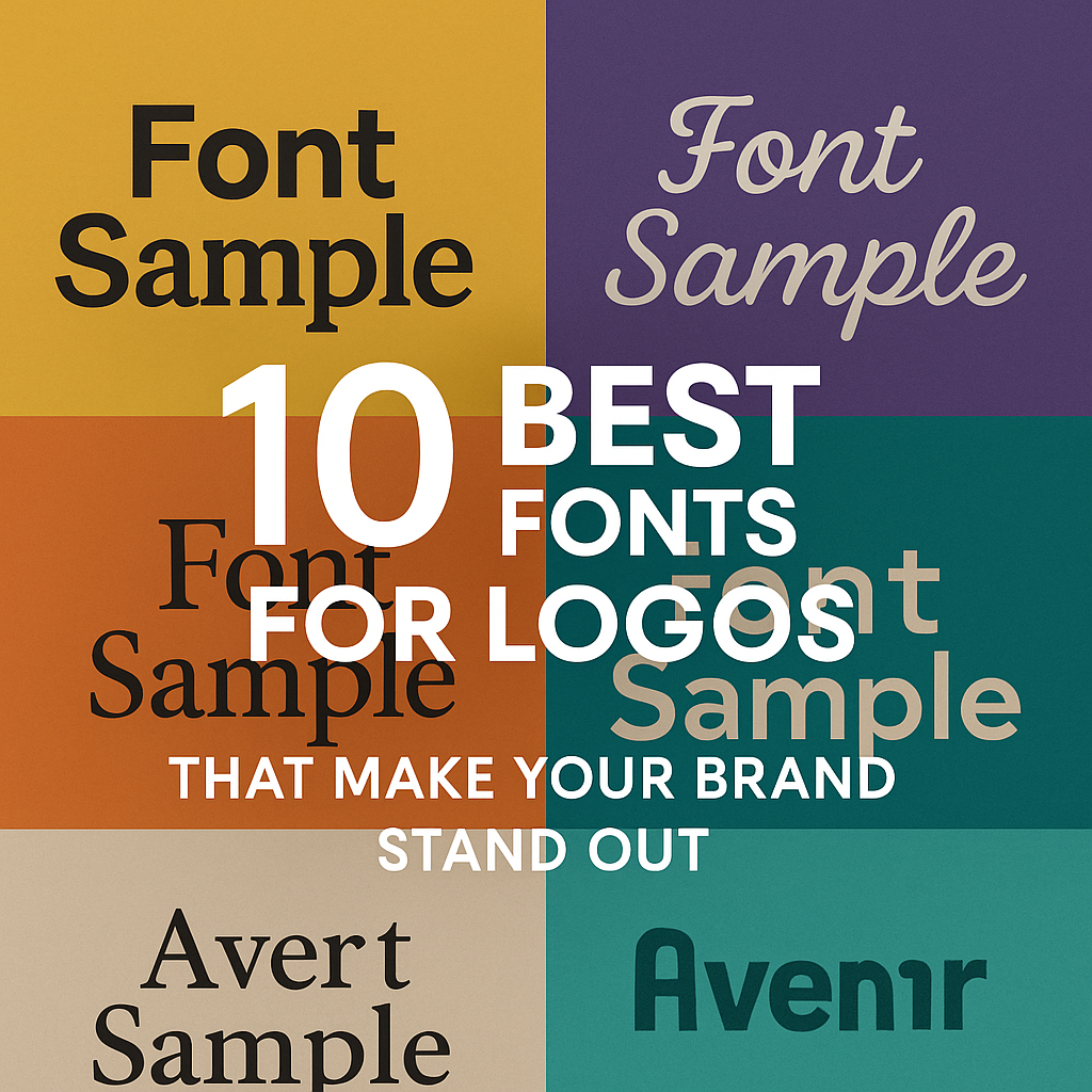
Below are the 10 best fonts for logos that have proven themselves in branding, along with insights and tips you won’t usually find in surface-level articles.
Helvetica: The Neutral Workhorse
Helvetica is famous because it does its job without calling attention to itself. But here’s something most don’t realize: the real power of Helvetica is its neutrality. It doesn’t inject personality; instead, it allows your brand colors, shapes, and design to take the spotlight.
One often overlooked detail is the difference between Helvetica and Helvetica Neue. Neue has more consistent spacing and works better on digital screens. If your brand lives mostly online, opting for Helvetica Neue can improve clarity and reduce eye strain.
Futura: Geometry That Builds Trust
Futura feels modern even though it was designed almost a century ago. Its circles and triangles create a sense of stability and balance, which is why architects, construction firms, and tech companies gravitate toward it.
A detail many designers forget: Futura has wide letterforms that leave extra breathing room. This makes it perfect for bold signage and large-scale use, but in very small logo applications, it can feel too spaced out. Adjusting kerning is crucial when using Futura for compact spaces.
Garamond: History in Every Curve
Garamond is often described as elegant, but the hidden advantage is its long history. When customers see Garamond, they subconsciously connect it with knowledge, culture, and reliability. That’s why universities, publishers, and heritage brands use it.
Here’s a practical note: Garamond uses less ink than many modern fonts. This makes it budget-friendly for businesses that print extensively, like publishers or product packaging brands. The sustainability angle can even become part of your marketing.
Gotham: The Font of Confidence
Gotham is modern and bold, but not intimidating. It has a geometric base, yet it feels human. That balance is rare. Political campaigns, non-profits, and big corporations have used Gotham to signal strength and transparency.
The thing most people don’t know: Gotham was originally designed for New York signage. That origin explains why it works so well in both print and digital environments — it was built to be seen clearly at a distance and still look clean up close.
Baskerville: Authority Backed by Research
Baskerville isn’t just a stylish serif. In a famous study, readers found statements written in Baskerville more believable than the same statements in other fonts. That psychological edge makes Baskerville powerful for industries where trust is everything: law, consulting, education, and luxury services.
It also performs beautifully in black-and-white branding. Many fonts lose their character when stripped of color, but Baskerville keeps its sharp edges and balance, ensuring your logo doesn’t lose impact in minimal formats.
Proxima Nova: The Digital Darling
Proxima Nova has quietly become the go-to font for online brands. Spotify, Wired, and Mashable rely on it because it scales beautifully across devices. It feels modern but avoids the coldness of purely geometric fonts.
A practical edge of Proxima Nova is its massive family of weights and styles. You can build not only a logo but an entire brand identity system with it — from website headings to app icons — without ever switching fonts. This keeps your branding cohesive and recognizable.
Didot: The Luxury Signal
Didot looks fashionable because of its dramatic contrast between thick and thin strokes. But this feature also makes it tricky. On screens with low resolution or on very small prints, Didot can lose its sharpness. Brands that use it successfully, like Vogue, often adapt it with custom modifications for clarity.
That’s the hidden tip: if you plan to use Didot, consider customizing it. Slightly thickening the thinnest strokes can make your logo far more versatile without losing the luxury appeal.
Montserrat: Modern Heritage
Montserrat has a unique story. It was inspired by old signs in Buenos Aires but redesigned for modern digital use. That makes it feel both familiar and fresh. It’s a favorite for startups, online shops, and creative agencies because it balances personality with readability.
Another advantage is pairing. Montserrat pairs naturally with serif fonts like Merriweather. Using Montserrat for the brand name and a serif for the tagline creates contrast that feels polished.
Avenir: Future-Proof Design
Avenir was designed with balance in mind. Unlike many geometric fonts, Avenir has subtle variations that make it feel less mechanical and more approachable.
The biggest benefit of Avenir is timelessness. Many fonts tie your brand to a specific decade (think of how 90s fonts instantly feel outdated). Avenir avoids that trap. If you want a logo that looks relevant today and still fresh in 20 years, Avenir is one of the smartest investments.
Pacifico: Handwritten Personality
Pacifico is playful and casual. It looks handwritten, which creates instant warmth and friendliness. Brands in food, lifestyle, and entertainment often use it to create an inviting vibe.
What most don’t realize: Pacifico can overwhelm long names. It works best with short brand names, and it shines when combined with simple icons or illustrations. Think of a coffee shop logo where the brand name is written in Pacifico with a small cup icon — approachable, memorable, and perfectly balanced.
Making Fonts Work Beyond the Logo
A font isn’t just about the logo itself. It sets the tone for your entire brand identity. When you choose a font, think about these overlooked but critical details:
- Cross-medium performance: Your font should look sharp on billboards, apps, and even embroidery. Always test across mediums.
- Cultural impact: Fonts can carry cultural associations. For example, serif fonts often suggest Western tradition, while handwritten fonts may connect better with lifestyle audiences.
- Font pairing: The strongest identities often use two fonts. A bold primary font for the logo and a softer secondary font for taglines or packaging can create depth.
- Trademarks: Not all fonts are free to use commercially. Before finalizing, check licensing. Many businesses have faced legal trouble for using fonts they didn’t license.
- Customization: The most iconic logos in the world didn’t just use fonts off the shelf. They modified them. Small tweaks — like adjusting the letter spacing, reshaping one character, or combining two styles — can make your logo unique while still rooted in a proven typeface.
Why Font Choice Defines Brand Longevity
Choosing a font is not a one-time design decision. It’s a long-term commitment. Fonts define recognition. Once customers associate your font style with your brand, changing it too often can damage trust. That’s why consistency is key. The strongest brands evolve slowly, making only subtle refinements over decades.
If you want your business to build trust that lasts, invest in a font that aligns with your identity and can grow with you.
Build Your Logo With Creative Alif
The right font can transform your brand identity, but finding the perfect one takes more than scrolling through a list. It requires understanding your audience, testing across mediums, and sometimes customizing the font itself. That’s what we do at Creative Alif.
We go beyond “picking a font.” We match typefaces to your vision, industry, and long-term goals, then craft a logo that works everywhere — online, offline, and in the minds of your customers.
If you’re ready for a logo that not only looks good but also builds recognition and trust for years to come, reach out to Creative Alif today. Let’s create a brand identity that stands out for all the right reasons.