Why is a label design important? That not a question at all because the label is the first thing that will be seen on shelves stuck to your product. The question is, how can you label be good enough to make people grab your product? Now that’s something that needs answering. Making a label design can seem easy, just print the logo on with a few disclaimers and you’re good to go. Not at all. Designing the best label for your product is a tricky task that requires a combination of detail and creativity.
Bright colors and vibrant combinations will make your product stand out, but will it match your brand’s theme and provide enough space for essential details? Here are the basic steps you need to know before you create the best label design for your product while balancing all the main aspects.
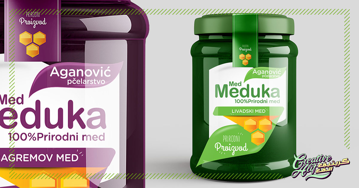
Blocking
Judging the proportion is a tricky part of label design. In a box design you have to judge the four dimensions but with a bottle label, you will need to put greater focus on the placement of each component. The technique is to create different blocks for each component to decide their placement accordingly. Just place all the elements, the typography, the logo, the disclaimers, tagline etc on to an artboard software and shuffle accordingly to see the multiple ways a design can work out.
Proportions
Don’t get carried away while putting together a label design. The bottles are supposed to be stacked against one another on shelves, so it’s okay to have a combination of occupied and vacant space on your label area. You might be concerned with the optimal use of your label space but don’t worry. It’s better if you give the design space to breathe. This way your logo and tagline will get the star positions and stand out even if they are written in a plain and direct design. Also, you won’t have to bother much to make them stand out amidst a plethora of other elements in the small label, so basically, minimalistic is the best for labels.
Sizing
Remember, the size you see on your graphics software is not what you will get. You need to judge your design based on how it will look in the final printed version of the label size. If you don’t pay attention to this, our logo or typography may end up being unreadable or too large in proportion. The best solution is to get your designer to give you a paper print according to your desired size. If that’s not available, you can zoom in on the design with on a graphics software and measure it with an external ruler until it’s the size you want. Record how much you zoomed in and judge your design according to that size.
Perception
The best label design companies will always pay heed to the perception hierarchy on the label. This is not rocket science, it just refers to the one by one process in which the viewer will visualize the image. For example, you have the logo, the specifics, the ingredients, and the tagline that you have to add. So, you will have to decide on the hierarchy in which you want your elements to be viewed on the label design. It’s possible that your products need their tagline in the spotlight and not the logo, or they advertise a key ingredient which needs to be viewed first, all these should be decided at the design level.
Now you know the basics to get started with the best label design for your product package or product endorsement stickers. So design your labels to package your products or employ the best graphic design companies in Saudi Arabia to do the job for you today!