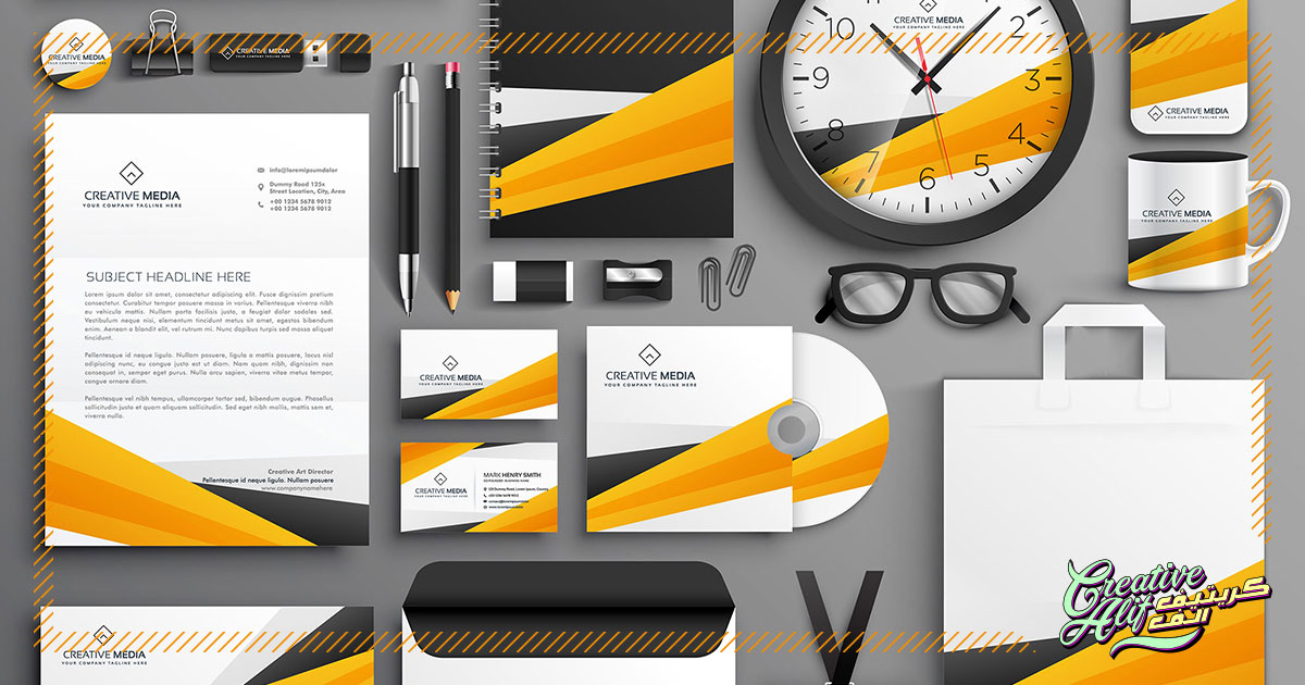
The frequent and accessible use of email and virtual messaging has made letters, both typed and handwritten, seem like an unnecessary expense. But, it’s evident from their effectiveness to this date, that virtual advancement has only worked to increase it’s importance even further.
No matter how easy and fast it is, an email can never replace the feel of your brand in your prospects hands. The best stationery design can help you achieve just that. It’s basically an instrument through which clients can witness all the aspects of your brand through a physical tool. This includes letterheads, business cards, envelopes etc. To do the best job with your stationery design, here are some aspects you will need to plan out carefully, o execute the best brand identity through stationery design.
Spacing
First of all, you will need to organize how much space each element takes up on your product. For example, for a business card, one side can be used to adorn your logo and the other side can cater to essential information. For a letterhead, it’s simple if you use the rule of thirds. Naturally, you need to leave enough blank space for written material. This way, one-third of your letterhead should have your brand logo, contact and location details while the other two thirds should be blank. Plan that out carefully.
Using The Logo
Your logo is the star of your brand identity. Use it wisely on your stationery design. It should be set in a way that showcases what your brand stands for clearly. For example, You can make the logo stand out by using it to cover a large area on your stationery components as compared to the other elements. Also, you can use the logo as a solo element to bring out its importance if it encompasses all that the masses need to know about your brand. The best logo design is enough to add functional and aesthetic effects to your stationery design.
Colors
Use colors appropriately. Usually, letterheads and business cards for corporate stationery tend to use monotones and single colors to emit a professional aura. But, the latest trends of rule-less design has given room to colorful, vibrant corporate letterheads and envelopes as well. As this will definitely make your brand stand out, you have to pay attention to the cost as well. More colors in the stationery will mean higher printing costs, so balance out the profit flux of your design against its costs to decide whether it’s beneficial for you.
Typography
The written matter on the stationery should be loud and clear. The colors and the placement serve the purpose to bring the reader’s eye towards the design. The typography should make sure the design is readable so that the design efforts do not go in vain. Also, make sure that the typography shows a clear vision of your brand. For example, if your enterprise is based in the middle east, then you can incorporate Arabic calligraphy in your brand identity to target customers of that particular ethnicity.
Printing Specifics
Printing the perfect stationery design is also a task that requires attention. Many printing techniques such as foil printing, emboss, reverse side printing, and letterpress is available to make your stationery design pop out. While all of that is quite expensive, if you want to stand out, then your choice is clear. A normal printing shop won’t be able to handle these luxurious specifics, so you may need to approach a commercial printer to take up this task.
There you go, the basic aspects to keep in mind to create the best stationery design for your brand. Balance out your design and make it accessible to increase your customer base, with a colorful, professional touch.