If you’re not a design expert, then you might not have the knack to recognize a good design from a faulty one. All of them are the same, right? Well not really. There is more to effective design than just throwing in some colors and graphics without any heed to viewer perspective and market efficiency.
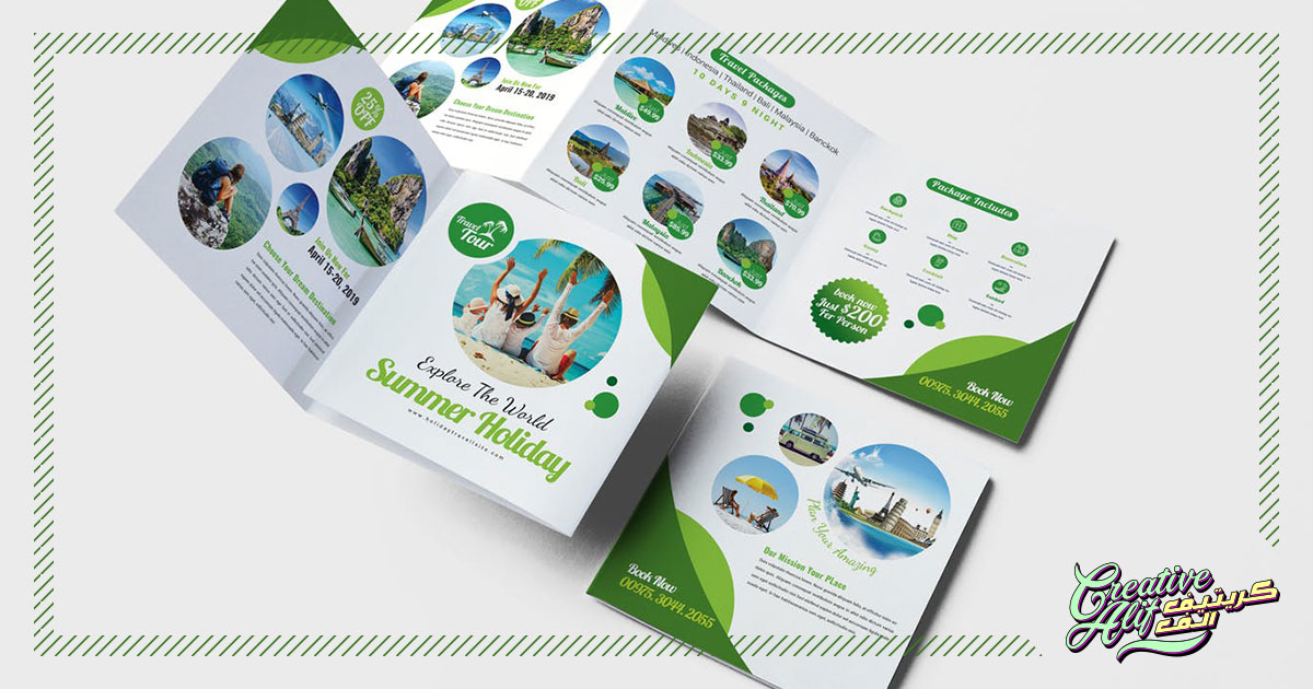
So, what elements make the best brochure design? Like all brand design components, brochures serve their own respective purpose to enhance a brand’s customer flux and presence. To achieve that your brochure needs to tick some important boxes, otherwise it’ll fail to deliver. Here are some points that should brochure designers should definitely keep in mind.
Be Minimalistic
As discussed before, a brochure design has a particular job to do. It’s important that your design facilitates that requirement rather than filling the whole thing up with all kinds of elements. Yes, design elements like 3D, gradients, glitter, typography, take lots of effort to complete. But, in the case of a brochure, all this might end up getting the viewer confused and overwhelmed. It’s better to take a minimalistic approach and let the brand speak for itself in a creative way. That will make the design easy to take in for your prospects and will leave room for further investigation and response to call to action.
Don’t Be Old School
Minimalistic doesn’t mean be plain and boring. Customers these days are savvy and trend followers, so the old, common templates and designs won’t work. It’s possible that some brands are more fun designing prospects than others, but that doesn’t mean they shouldn’t get their share of creativity. That’s because brands exist because of their market, companies like, stock market consultancies, corporate agencies, all fill a niche in the market. The best creative designs can be created by being minimal and professional, think out of the box. Go for something people don’t tend to see usually. It can be anything from, bold, wide lettering void of imagery on the first page, or vibrant imagery void of typography. It can be a blank question on the first page or a unique folded style, get creative!
CTA Integration
The main focus for your brochure design should be on the call to action. Basically, that’s what all the fuss is about right? If you’re calling towards action on the last line, of the last page, then what’s the point of your brochure? Make sure your design gives it the space to stand out and be clear and loud, otherwise the brochure will just turn out like other advertisement tools and not serve its specific purpose. You can also try putting it in multiple times on your brochure, as long as it doesn’t look forced. The point is, the CTA should be set in a way that once it goes to a customer’s hands, they just don’t miss it, even if they just skim around it without reading everything.
Don’t get confused by all this, the points are as clear as they can be, just make sure that:
- The design grabs attention
- Gives out effective CTA
- Showcases your brand as it is
Once you’ve checked all these boxes off, you can be sure that your brochure design company has done a good job, and your design is ready to reach the masses!