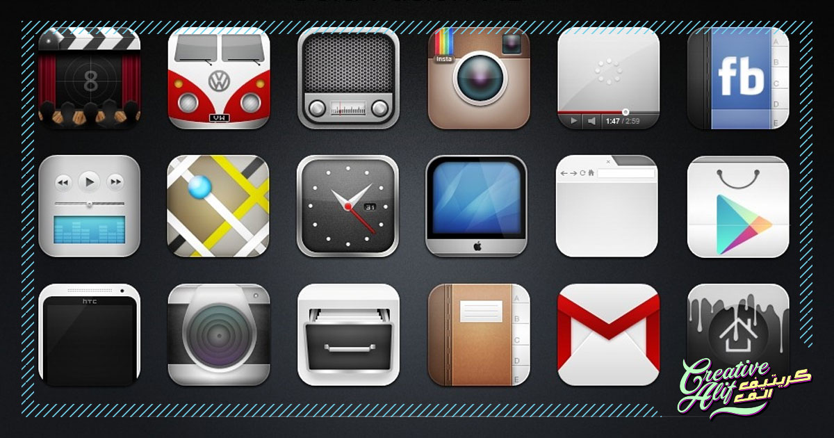
Did you know that judging a book by the cover is the on-going trend online? Most people tend to select which app to download and use, and which to avoid, based on their icons. Also, once your app is established, the icon will become the face of your enterprise.
When the popularity and effectiveness of your app are at stake, you should make sure the icon is designed with utmost attention and care. But what should the best mobile app icon design have? We’ve rounded up some tips from the experts to create the best mobile app icons that are worth clicking.
Audience Orientation
We mentioned before that when a user searches through an app store, he will click on the app that appeals to him the most. That doesn’t mean you should go overboard with the colors and vibrancy of your app icon. Rather, you should concentrate on how the icon connects with your target audience. If you’re trying to attract corporate clients then sleek, professional colors and designs are the keys. If you’re targeting women then you should incorporate feminine attributes to your icon.
Balance Things Out
Your design should have equal amounts of color and playfulness blended with functionality. The icon should show what your app offers, for example, food, navigation, taxi service etc. Other than that, it should have the feel you want your clients to have required to open the app. For example, the food ordering app should have an appetizing look, whereas the navigation app should look straightforward and informative.
Your App In A Nutshell
The best app icons replicate the look and feel of their app. The design elements used in your app should be incorporated to some extent in your icon so that the user knows what to expect. That’s similar to when you shop for a product at the supermarket, the packaging design shows you what’s inside, and you judge the product accordingly. For instance, if your app has a uniform color throughout all it’s screens, the icon should sport the same color as well.
That’s a guide for an app icon design. While the developers and engineers will be responsible for how the app works on the whole, the app designers can do their bit by putting their best into the icon design.