Letters are an important mode of communication today for business companies to correspond with clients and contemporaries. More than that, it’s significant collateral for your brand, as its a physical representation fo your brand.
Through an effectively created letterhead design, you can send out a message of professionalism to your prospects. It will also help you put a great first impression. Also, it will give an outlook about your marketing techniques and brand identity in a physical form.
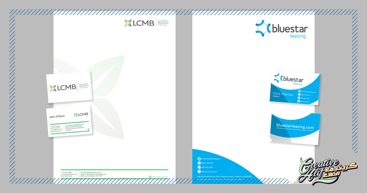
Design
An effective letter design technique is simple, keep it short and to the point. Obviously, you’ll want to include your contact details, logo, and a little about what your brand stands for or offers. Give your logo the spotlight in the design. Everything else should work together to lead to your logo, so it’s most visible and vibrant. This will showcase your identity, and make your brand etched into your client’s memories.
Also, don’t overdo it with the design. You don’t want to traffic your letterhead with design components and leave no space for the written matter. Even if there is space, you need to make the written matter stand out to highlight it’s importance and credibility. Blend aesthetics with functionality to create a balance.
Components
What goes on a letterhead? This will depend on where your design travels. If it’s meant to be used for in-house connections than the general contact number for your office doesn’t need to be included. Also, there are some legal requirements for a letterhead that need to be followed as well, make sure your stationery design makes room for that to be incorporated effectively. Choose the right details to add in your letter so your space and design efforts don’t go to waste.
Color
As we mentioned before, the best stationery designs give out professionalism and speaking in general terms, shows a no-nonsense message. So, while it’s eye-catching and fun, colors should be used at a minimal ratio in a letterhead. Vibrant colors will also take the attention, and importance off the actual letter, which usually comprises of official details, quotations and company references. If the design hinders in the purpose, what’s the use? Make sure to use colors at a minimal, enough to highlight your brand and not obstruct the function.
Viewer Hierarchy
We’ve discussed this point before in the best label design tips. Proper integration of viewer hierarchy is important in a letterhead design. You get to decide what you want your reader to see first. Make sure the logo, as mentioned, is in the star position. Apart from that, all other details should be placed in a way that they are accessible and make way for the rest of the letter as well. The best stationery design will include the logo at the top position with contact details at the end to give a call to action for the letter.
This wraps up the main aspects you need to observe in your best letterhead design. A combination of professionalism, functionality, and creativity, your letterhead should look it’s best to present your official matters in an effective way.