You sit down to design something. You pick a color. Change it. Try a new font. Move things around. Still feels off.
So you tweak it again… and again… and now you have spent an hour with nothing solid to show.
That is not a creativity problem. That is a direction problem.
A mood board fixes this before you even open your design file. It gives you a clear visual path so you are not guessing your way through the process.
Once you start using it properly, your work feels faster, cleaner, and way more put together.
What is a mood board in graphic design?
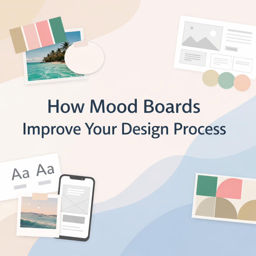
A mood board is a visual setup that shows how your design should look and feel before you start building it.
It includes colors, fonts, images, textures, and layout ideas. All of it placed in one space so you can see the direction clearly.
Think of it like lining up your thoughts before you speak. You are not designing yet, you are deciding how the design should feel.
Designers use mood boards in branding, website design, UI UX, and even social media content to avoid messy starts.
How mood boards improve your design process
How do mood boards help you stop second guessing?
When you do not have a clear direction, every choice feels like a gamble. You keep trying things just to see if they work.
A mood board removes that feeling.
You already know your color palette. You already know your font style. So instead of guessing, you just follow what you have set.
Your brain stays focused instead of jumping around.
How do mood boards make your workflow faster?
Without a mood board, you are designing and searching for ideas at the same time. That breaks your flow.
With a mood board, everything is already in front of you. You are not switching tabs every few minutes.
Let’s say your board shows soft colors, clean spacing, and simple fonts. You stick to that. You are not suddenly testing bold styles that do not fit.
And that alone cuts down a lot of wasted time.
Why do mood boards make designs look more polished?
When a design feels clean, it usually means everything is working together.
Mood boards help you keep that balance. Your colors match. Your typography feels connected. Your visuals follow the same tone.
Nothing feels random.
This is what makes a brand or a website feel professional without trying too hard.
How do mood boards make client work easier?
Clients usually have an idea in their head, but explaining it is not easy.
When you show them a mood board, things click faster. They can see the direction instead of trying to imagine it.
You will notice something interesting here. Feedback becomes more specific. Instead of vague comments, you get clear reactions.
A simple trick that works well is showing two options. One that feels safe, and one that pushes a slightly different style. Clients respond better when they can compare.
Why do mood boards cut down revisions?
Revisions mostly happen when the starting point is unclear.
A mood board sets that starting point.
Once it is approved, you are not going off track. You are building on something already agreed on. That keeps the project steady and saves you from endless back and forth.
How to create a mood board step by step
What should you figure out before anything else?
Start with the goal.
What are you designing? Who is it for? What kind of feeling should it give?
If this part is vague, your mood board will feel random. And that will show in your design later.
How do you pick the right references?
Do not collect images just because they look cool.
Pick visuals that match your goal.
If you want a clean and modern look, go for simple layouts and soft tones. If the project needs energy, pick bold visuals and strong contrast.
Every piece you add should support the same idea.
How many colors and fonts should you use?
Keep it tight. Too many options will slow you down.
| Element | Limit |
|---|---|
| Colors | 3 to 5 |
| Fonts | 1 to 2 |
| Images | 5 to 10 |
This keeps your direction clear and easy to follow.
How should you arrange your mood board?
Do not throw everything in randomly.
Group similar things together. Keep colors in one area, fonts in another, and images in another.
This makes it easy to scan when you are designing.
Should you write notes on your mood board?
Yes, and it helps more than people expect.
Short notes like “keep spacing wide” or “use soft shadows” guide your decisions later.
When you are deep into the design, these small reminders keep you on track.
Small details that quietly improve your results
Try turning your mood board into black and white. This shows if your contrast is working. If everything looks flat, your design will too.
Use real text instead of placeholder text. It gives you a more honest view of spacing and readability.
Also, check your mood board on different screens. What looks good on a laptop might feel different on mobile. This matters a lot in website design.
What mistakes should you avoid?
Adding too many styles is one of the biggest issues. It makes your direction unclear.
Copying designs without adjusting them to your project can make your work feel off.
Ignoring your audience can also break the design. A kids brand should not feel like a corporate page.
Keeping things simple usually fixes these problems.
When should you use a mood board?
Use it at the start.
Branding, website design, UI UX, logo design, social media. If the project needs a clear visual direction, a mood board helps set it early.
How mood boards help with SEO and AI search visibility
When your design is clean and easy to follow, people stay longer and understand your content better.
That helps your SEO.
Structured layouts, clear typography, and consistent visuals also make your content easier for AI tools to read and pick up. This improves your chances of showing in featured snippets and AI answers.
Conclusion
A mood board gives your design a clear path before you start. It helps you move faster, stay focused, and avoid messy decisions later.
Once you get used to it, designing without one feels like guesswork.
If you want your designs to feel clear from the very first glance, start with the right direction.
Creative Alif helps you plan, design, and shape visuals that actually make sense and connect with people. If you are working on a brand or a website, now is a good time to get it done properly.