You know that feeling when you open a website on your phone and everything looks off. Tiny text, buttons you can’t tap properly, and you keep zooming in just to read one line. Most people don’t try to fix it. They just leave.
Now think of a website that opens clean, fits your screen perfectly, and feels easy right away. You scroll without thinking. You click without missing. That smooth experience is what responsive web design is all about.
If you are building a website or even thinking about one, this is something you need to get right from the start.
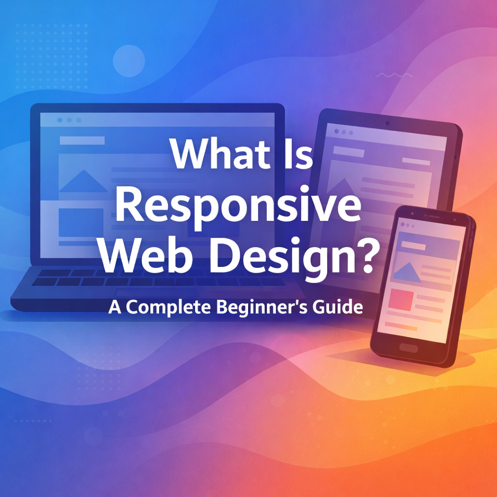
What is responsive web design and how does it actually look
Responsive web design means your website adjusts itself to the screen it’s being viewed on. No extra steps, no zooming, no sideways scrolling.
On a laptop, your content might sit in multiple columns. On a phone, the same content stacks neatly so it’s easy to read. Images shrink to fit. Text stays clear. Nothing feels cramped.
It’s like your website knows where it’s being opened and fixes itself instantly.
Why responsive web design matters for SEO and users
People don’t wait around for bad experiences. If your website feels hard to use, they’re gone in seconds.
A responsive website keeps things simple. Pages load better, everything is readable, and users can move around easily. That keeps them on your site longer.
Search engines notice this too. When users stay, scroll, and interact, your chances of ranking improve for searches like responsive web design for beginners, mobile friendly website design, and how to make a website responsive.
And honestly, it also just makes your brand look more professional. A clean website feels trustworthy right away.
How responsive web design works behind the scenes
Behind the scenes, your website is not using fixed sizes. Instead, it uses flexible layouts that adjust based on screen width.
There are rules in the design that say, “if the screen gets smaller, rearrange things like this.” That’s how a wide layout turns into a vertical one on mobile.
Images are also set to resize so they don’t break the layout. Everything works together quietly so the user doesn’t even notice the changes happening.
How layouts should change across devices
A good layout feels natural to scroll through. On bigger screens, you can place content side by side. On smaller screens, everything should stack in a clean order.
What really matters is what shows up first. People on phones scroll fast, so your important content should appear early.
And spacing matters more than most people think. When things are too close together, it feels messy. When there’s enough space, the page feels calm and easy to read.
How images can improve or ruin responsive design
Images can make your website look great, or they can slow it down badly.
If an image is too large, it can push content out of place or take too long to load. That’s where things start to feel frustrating for users.
The fix is simple. Images should adjust with the screen and be optimized so they load quickly.
Also, using smaller image sizes for mobile can make a big difference in speed. It keeps everything running smoothly without users even noticing.
How navigation should work on mobile screens
Menus that look fine on desktop can feel messy on a phone.
That’s why many websites switch to a simple menu icon on smaller screens. Tap it, and the options appear. Clean and easy.
Buttons also need to be easy to tap. If someone has to zoom in just to click something, the design isn’t doing its job.
What text settings work best for responsive websites
Text is one of the first things users notice. If it’s hard to read, they won’t stay.
A comfortable font size, enough spacing between lines, and short paragraphs make a huge difference.
Think about it like this. If someone can scan your content quickly and understand it without effort, you’re doing it right.
What are breakpoints and how do they help
Breakpoints are points where your layout changes to fit the screen better.
For example, a three-column layout might switch to one column when the screen gets smaller.
Instead of picking random sizes, it’s better to adjust things when the design starts to feel tight. That way, the transition feels smooth instead of forced.
Why mobile-first design is a smart approach
Starting with mobile keeps things simple. You focus on what really matters because there’s less space.
Once that works well, you expand the design for larger screens.
This approach also helps with speed and fits well with how search engines look at websites today.
Common responsive design mistakes and how to fix them
One big mistake is trying to fit too much on a small screen. It makes everything feel crowded.
Another issue is tiny buttons. If users can’t tap comfortably, they’ll get annoyed fast.
And skipping testing is a classic mistake. A design can look perfect on your screen and still break on someone else’s device.
Checking your site on different screens saves a lot of trouble later.
How responsive design affects website speed
Speed matters a lot. A slow website loses users quickly.
Heavy images, extra code, and complex layouts can slow things down. Keeping things light and simple helps your site load faster.
And when your site loads fast, people stay longer and interact more.
How to test if your website is truly responsive
Don’t just resize your browser and call it done.
Open your website on actual phones and tablets. Click around, scroll, and try filling forms.
Pay attention to how it feels, not just how it looks. If something feels off, it probably is.
How responsive web design helps you rank better
Search engines look at how users behave on your site. If people stay, scroll, and interact, it sends a positive signal.
Responsive design helps improve mobile usability, page speed, and overall experience.
That’s why it supports rankings for terms like responsive website design for SEO, mobile optimization techniques, and improve website responsiveness.
Conclusion
A website that works smoothly on every screen feels effortless to use. And that’s exactly what keeps people on your site.
If your website still feels off on mobile, you’re losing visitors without even realizing it. Fixing that can change how people see and interact with your business.
If you want your website to look clean, load fast, and feel right on every device, Creative Alif can build you a responsive design that turns casual visitors into real customers.
FAQs
What is the main goal of responsive web design?
The main goal is to make a website adjust smoothly to any screen size so users can read and navigate without effort. It keeps layouts clean, text readable, and buttons easy to tap across phones, tablets, and desktops. This improves user experience and helps reduce bounce rates.
How is responsive web design different from adaptive design?
Responsive design uses one flexible layout that changes based on screen size, while adaptive design uses fixed layouts designed for specific devices. Responsive design is more flexible and easier to manage because it works across all screen sizes without needing separate versions.
How can I check if my website is mobile friendly?
You can test your website by opening it on different devices like phones and tablets. Check if the text is readable, buttons are easy to tap, and no horizontal scrolling is needed. You can also use tools like Google Mobile-Friendly Test to get a quick analysis.
Does responsive web design improve SEO rankings?
Responsive web design helps improve SEO by making your website easier to use on mobile devices. It supports better page speed, user engagement, and mobile usability, which are all important ranking factors in search engines.